Elevating E‑Commerce Experience
recognitions

Valentina, your UX/UI commitment to the project is exceptional! Thank you for your heart and hard work, Figma Guru! Good luck with future endeavours!

Dear Valentina, Thank you for acting proactively, establishing trustful relationships, and demonstrating a strong commitment to the Customer’s success.
Enhancing Purchase Flows for a Global Education Leader
I was part of the design team supporting the e-commerce platform of a global education company that creates textbooks, digital products, assessments, and personalised learning tools.
challenges
The goal was to refine the existing experience and expand it to new regions while maintaining consistency across products and adhering to new brand guidelines.
results
Earned two client recognitions for outstanding contribution and commitment.
Reduced friction in the purchase flows by improving the navigation & checkout.
Designed new Hybris templates and various features, including real‑time stock status, while upgrading the visual style to the new brand vision.
Successfully rolled out the upgraded experience to two major markets.
Documented common design patterns and shared ideas to support cross-product consistency.
target audience
Students, educators, professionals, and institutions. My focus was on the Assessments division, which provided psychologists, educators, and HR professionals with cognitive tests, certifications, and diagnostic tools.
my role & team
I joined a client's design team of seven people and collaborated with various product teams.
Assessments product team:
Product Owner, Business & Marketing team
Three Business Analysts (BA)
Design Lead & UX/UI Designer (myself)
Two Content Strategists
Two QA specialists
The engineering team with two Architects, two FE & two BE developers, and two BAs.
process
We worked in two-week sprints using Scrum. I advocated for UX improvements in the product roadmap, managed the UX backlog and participated in cross-product design critiques to ensure a unified global experience.
Client Feedback
I’m the product owner for Assessments and Educator storefronts and have worked with a wide range of UX professional over the years. Valentina is the lead UX’er on the Assessments storefront and it has always been a pleasure to work with her.
Valentina is extremely talented with skills that reach beyond just design or UX as she's always looking for ways to push the boundaries of how we can make our product better. Valentina’s attention to detail and general UI/UX creativity has made a huge impact on our storefront that has seen reduced friction in customer ordering behaviour and improved conversions.
Valentina has a natural gift for design, user experience and client workflows. She is also an excellent team player, quickly shifting focus from one team to another as they all clamour for her assistance. We are absolutely lucky to have such a smart and talented UX professional on our team.
Product Owner, Director
Guided Journey
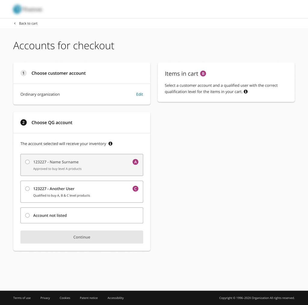
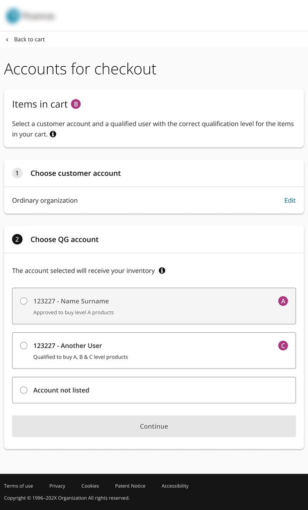
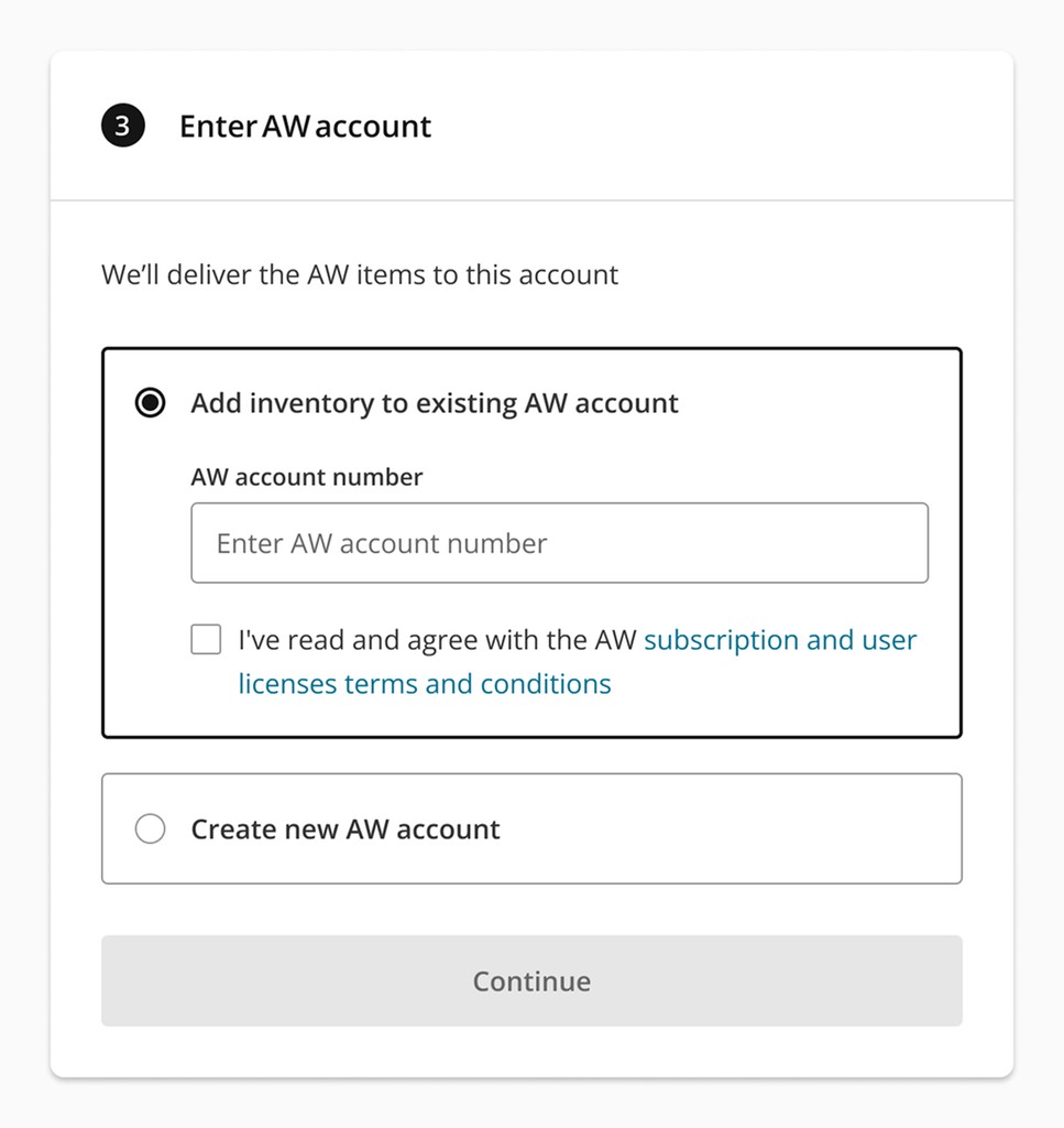
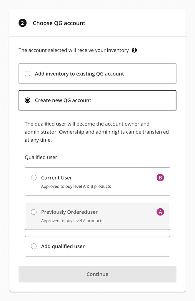
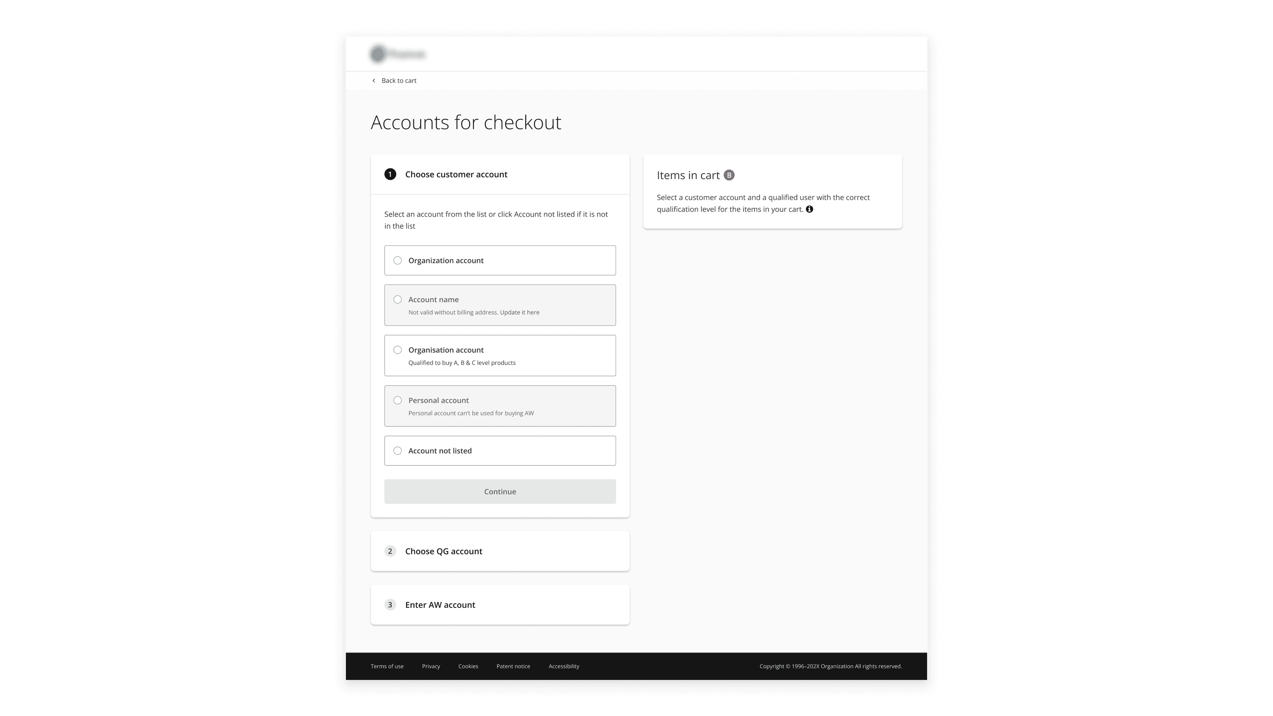
Reducing Drop‑Offs with Streamlined Multi‑Step Checkout Flow
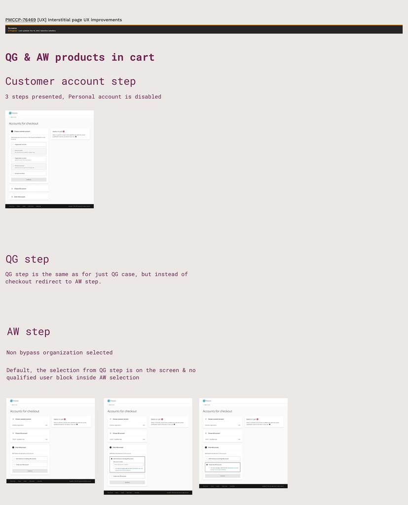
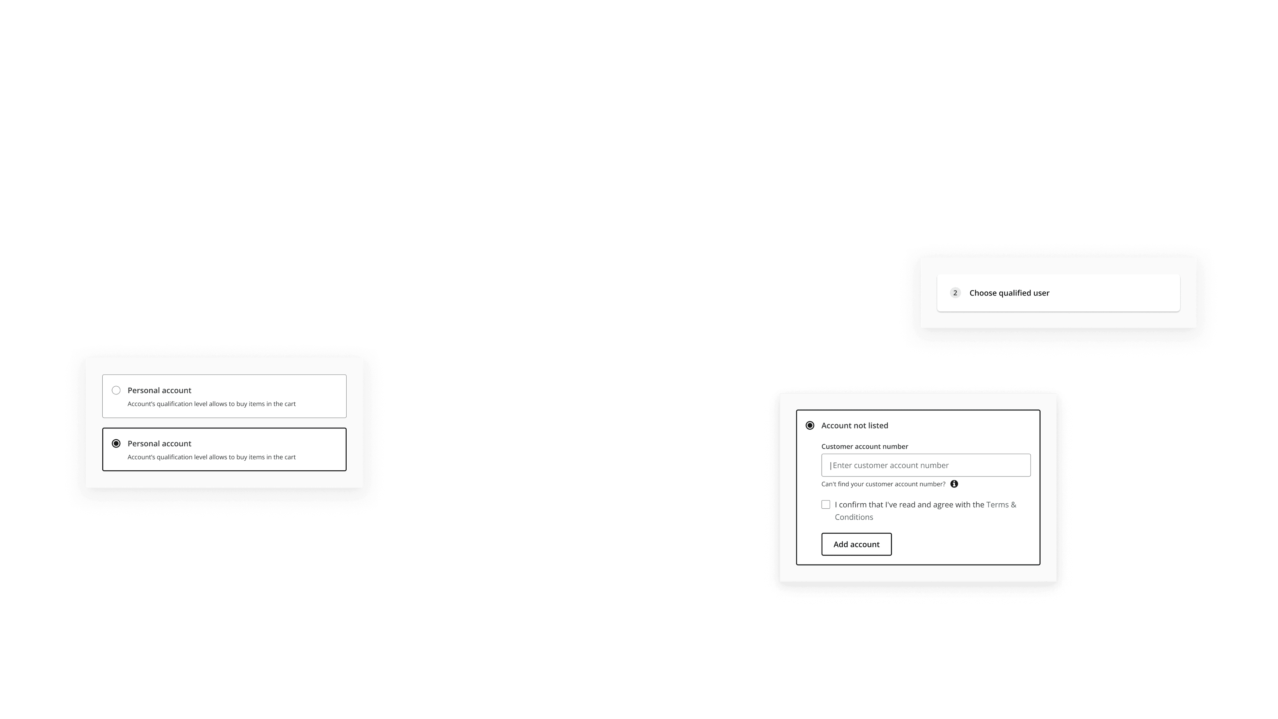
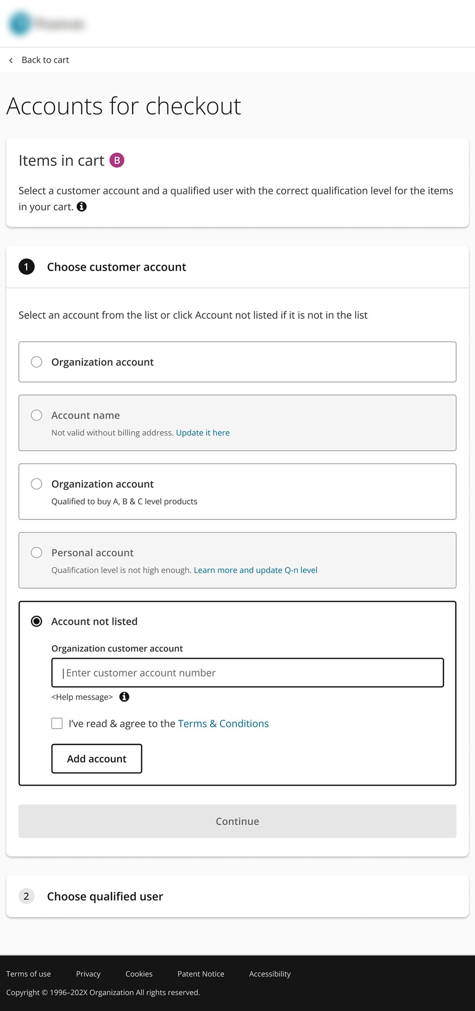
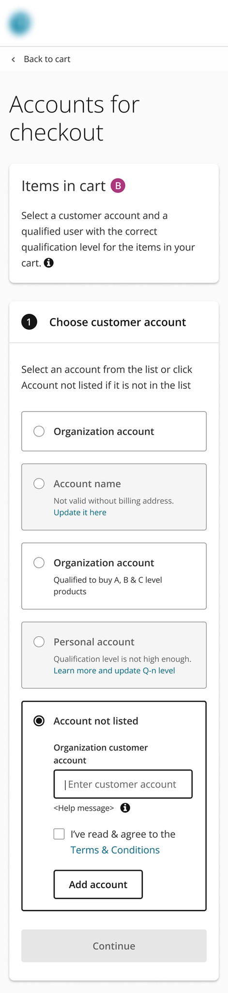
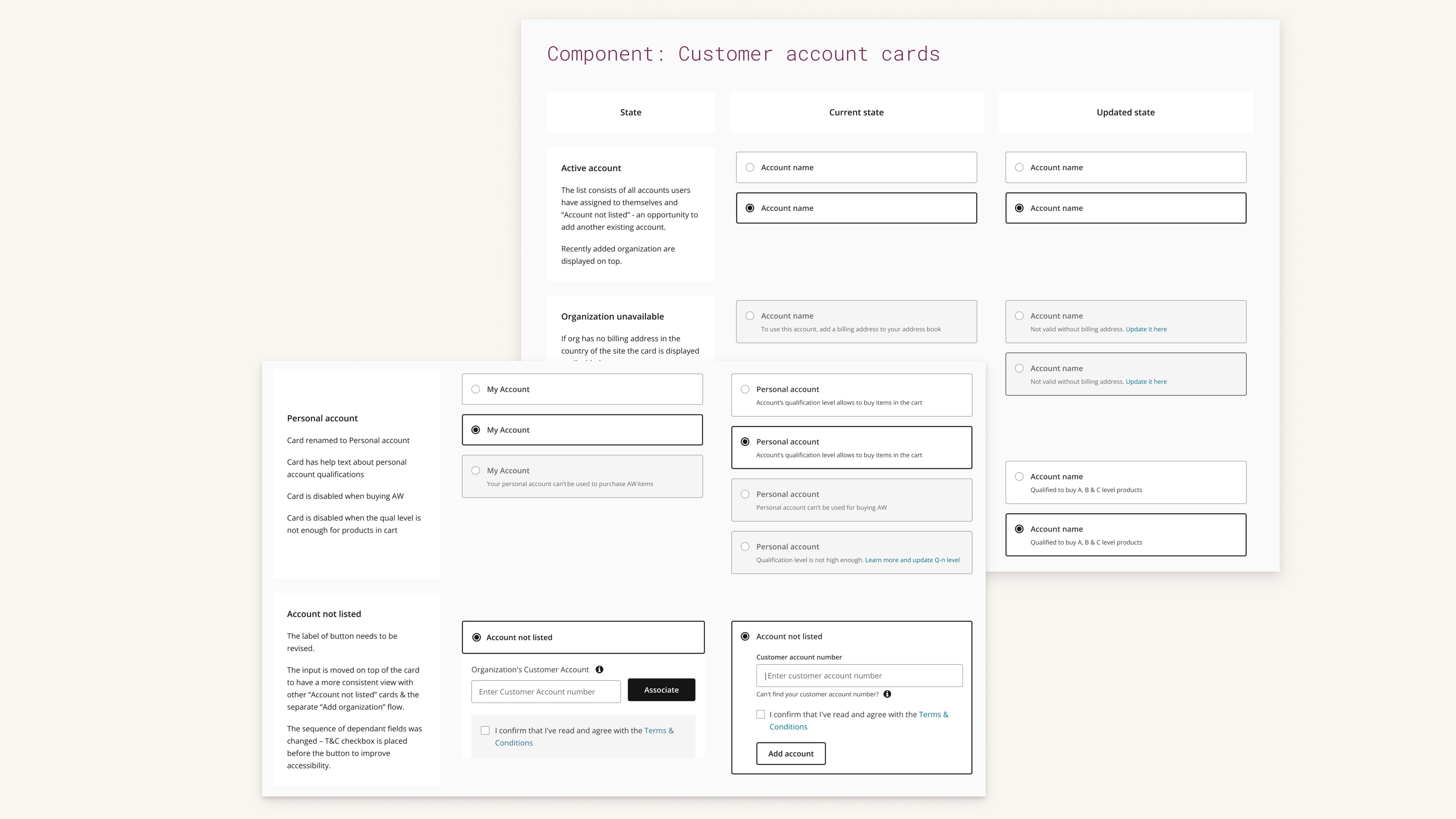
Assessments e-commerce supports both B2B and B2C purchases. Products require qualification levels A, B, or C. Buyers must attest to their qualifications to purchase certain products.
challenges
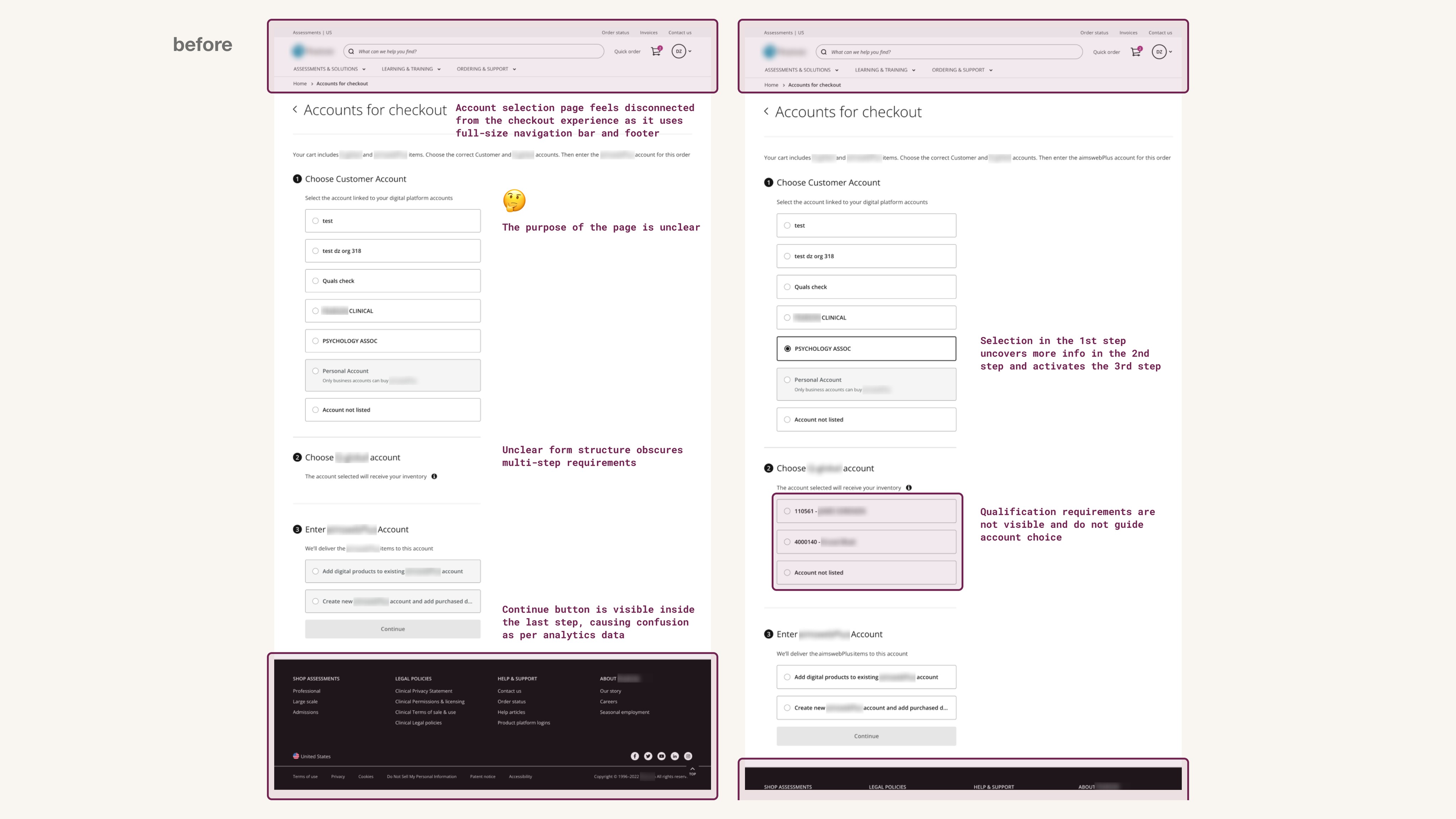
Analytics showed a significant drop-off at the account selection step, especially for high-qualification products. Users clicked the "Continue" button early without realising the form had multiple steps. Many users were unsure which account to select for eligibility. This resulted in abandoned carts and customer support calls.
task
Redesign the checkout process to reduce drop-offs and lower cognitive load during account selection.
research & analysis
I conducted a UX audit, stakeholder interviews, and heuristic evaluation to identify friction points in the flow.
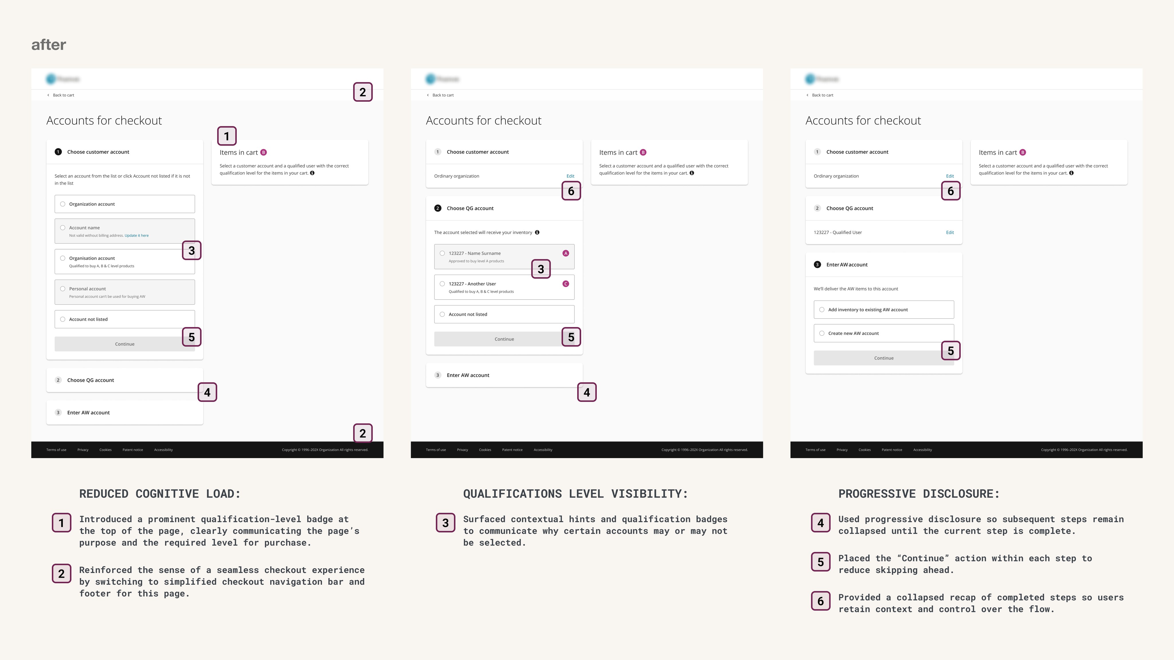
design solution
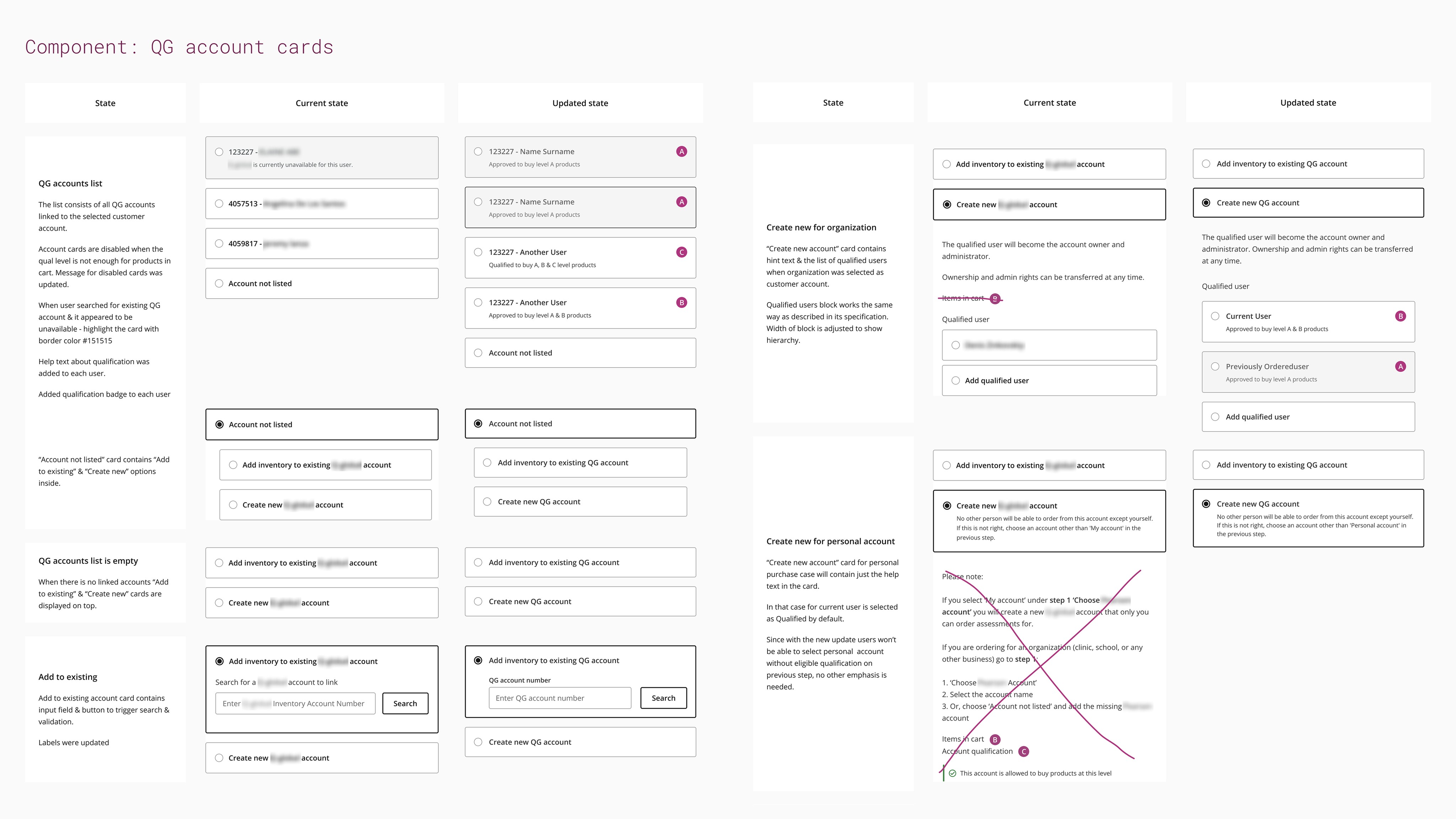
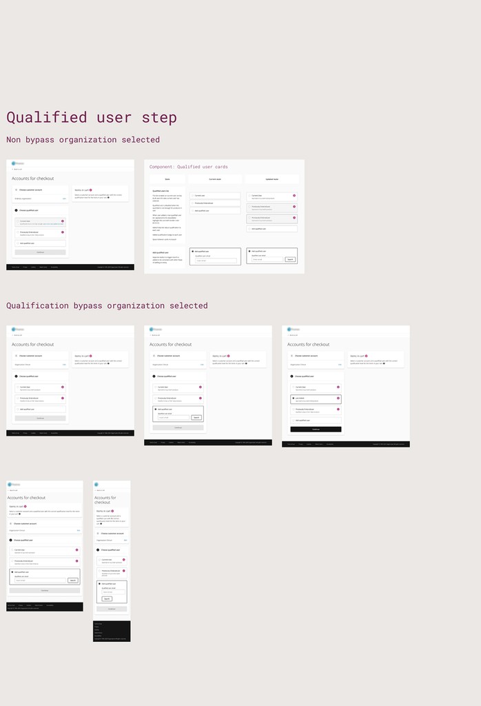
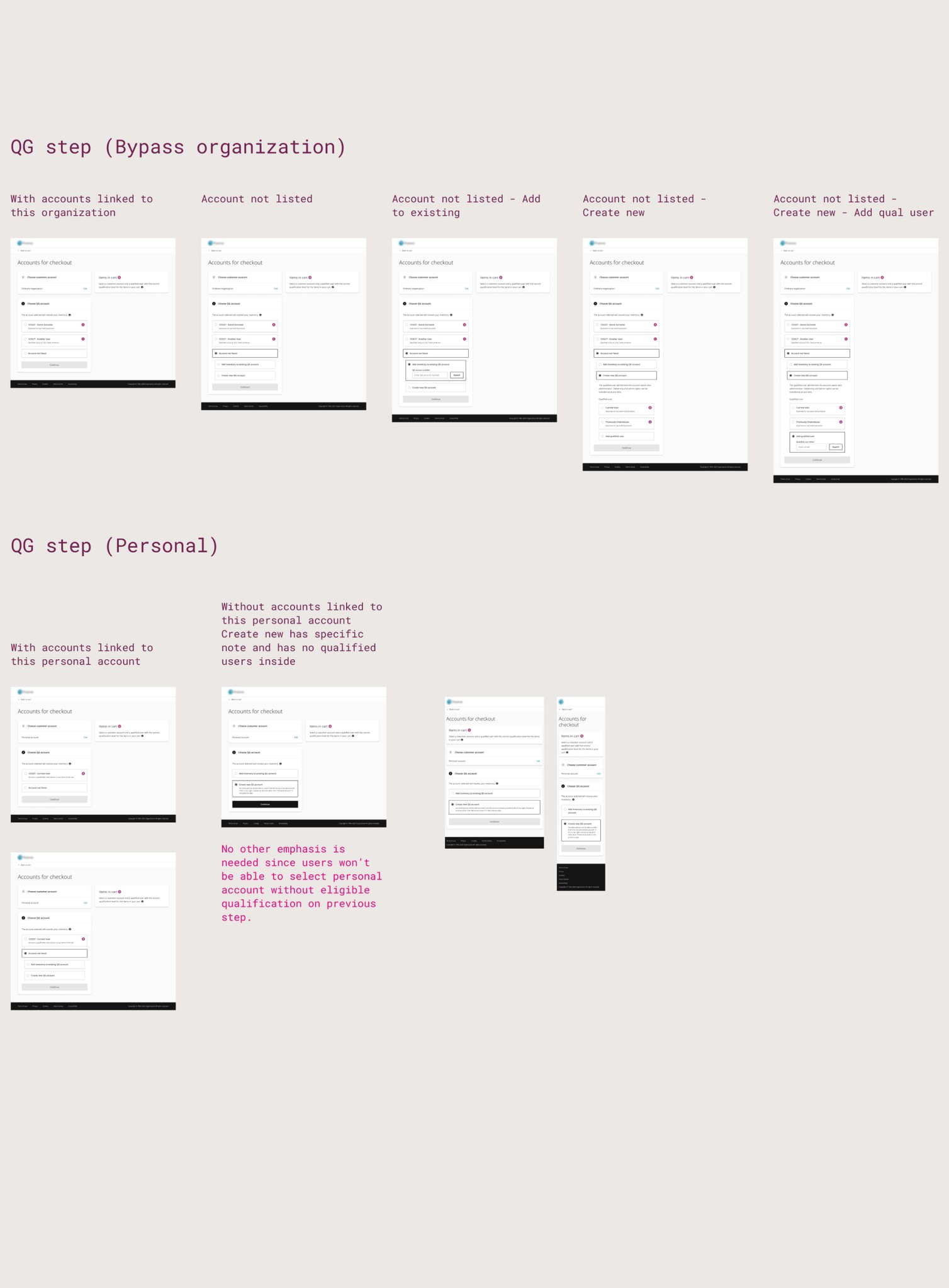
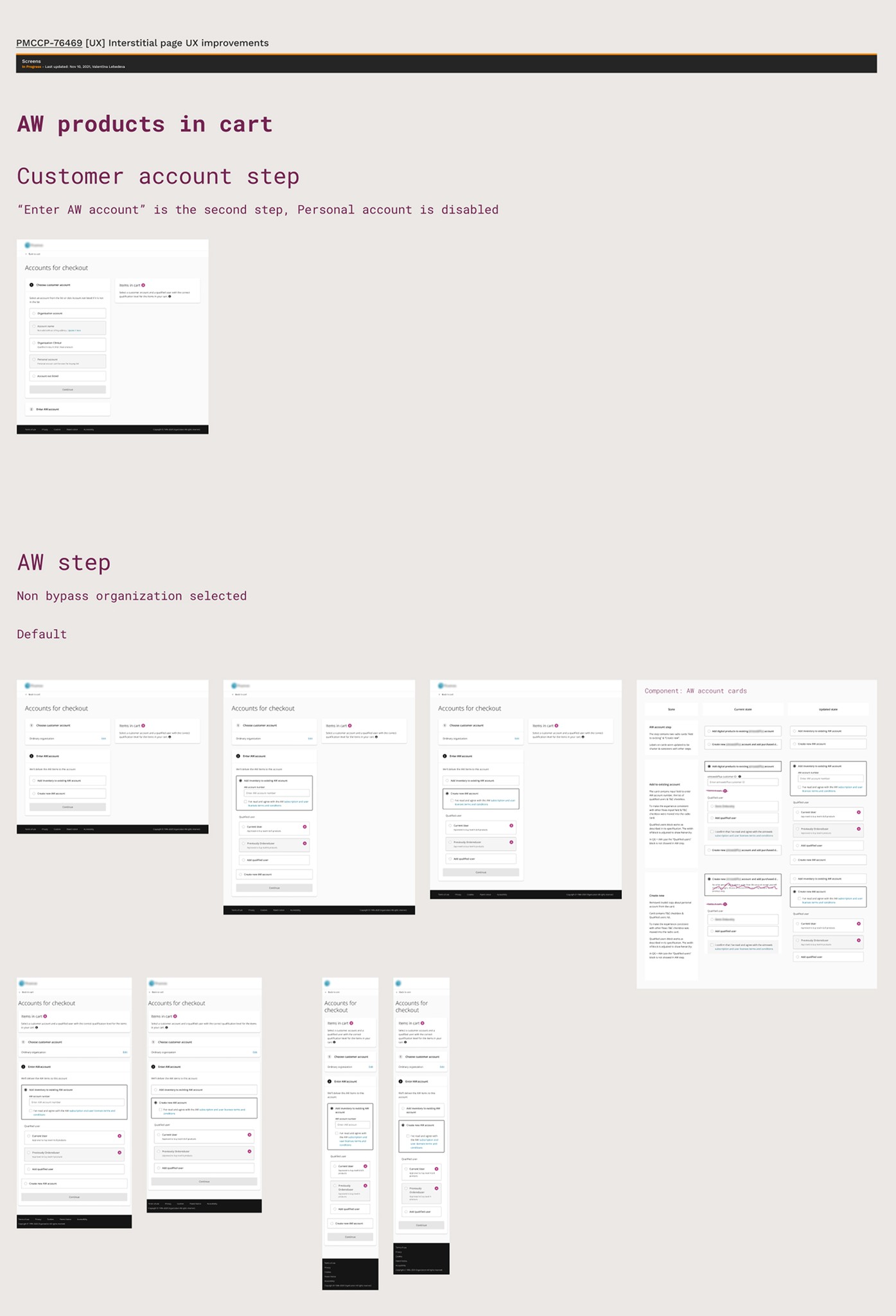
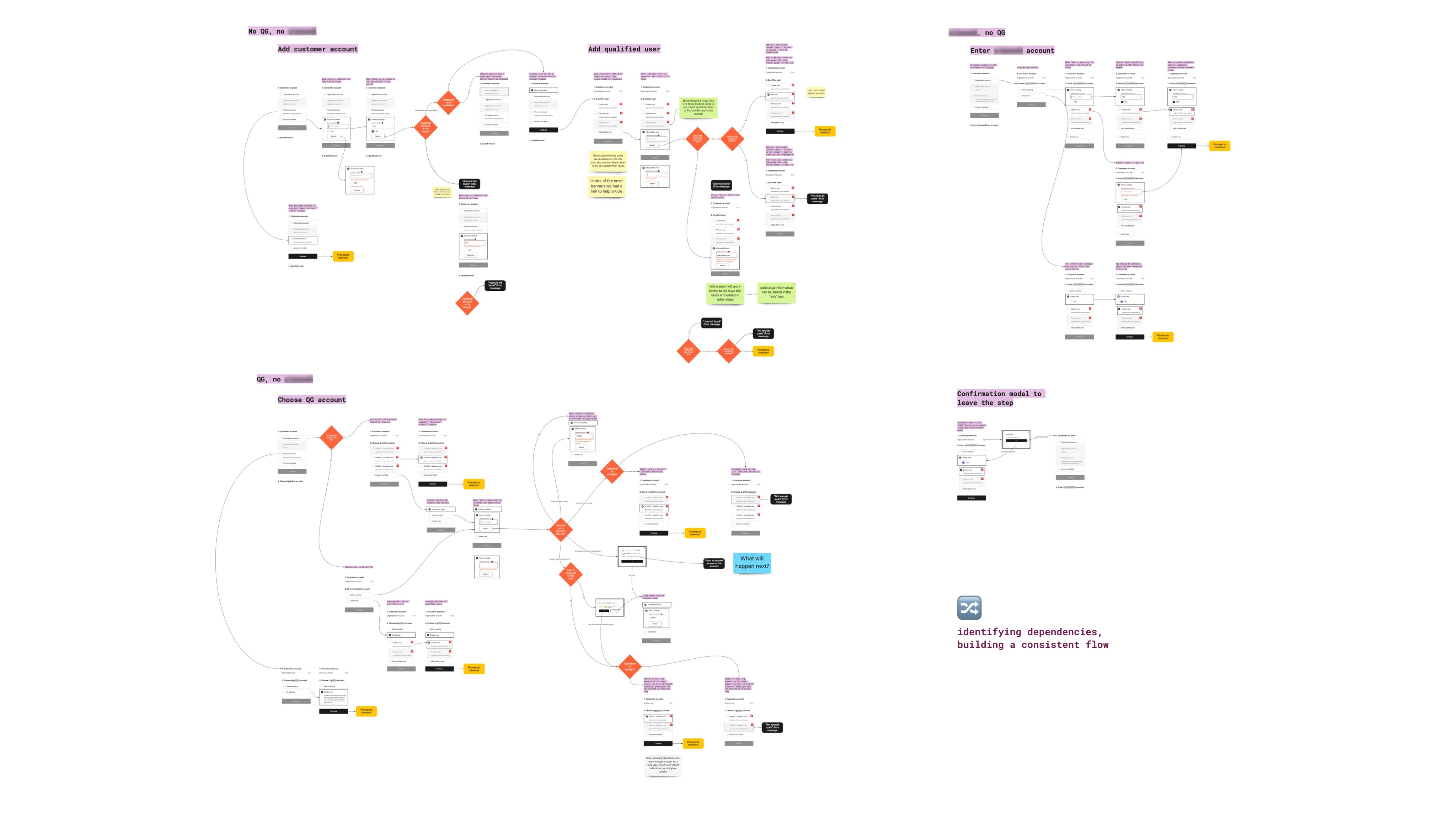
I reimagined the account selection flow to be contextual, consistent, and focused on one decision at a time. Mapped out all states and scenarios, identified recurring patterns and standardised component behaviour so similar scenarios behaved predictably.
handoff & collaboration
I stayed in touch with the engineering team during the handoff and implementation to resolve questions and maintain the intended experience. Handoff artefacts delivered to engineering:
Before-and-after component documentation with required states.
Interaction flows with validation rules and edge cases.
High-fidelity responsive wireframes.